For this photo I mad the pink a little darker so, it was more of a magenta color and made the brightness brighter on the yellow flower.
In this photo, at the beginning, the marbles were yellow and not clear and shiny. So, i made the brightness brighter and then I changed the purple and made it lighter.
For this one I made the green less bright because it was taking away from the marbles that looked faded. Then, the purple turned darker as well.
I made the white more white and changed the brightness to +30 so then the pinks and colored hearts were more bright.
These photos represent how I roll because, it is my style. My style is bright and colorful! It shows through onto these photos by, the color and contrast. I think the patters on the fabrics add a pop of change to the photo and then I added the marbles onto the fabric for a shine effect.


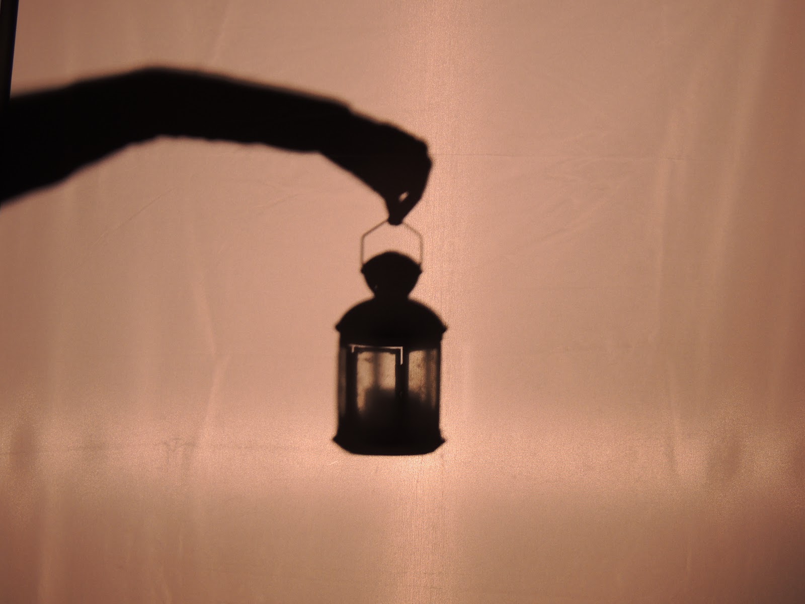
 Fore this photograph I set it up to I hung lights in my room on a blank wall. Then I moved the candle holder closer to me so that I could get the bokeh effect coming out of the photo. I edited this one in lightroom and added the vignette. I also made it black & white while darkening the blacks.
 I did this one on the beach and made the dino sit a little further away from me and then set him in the sand. I edited this one in lightroom, I edited this one by darkening the blacks & then blurring out the edges.
 I took this one in my room and I set it up the same as the candle photo. I edited this one in lightroom. I wanted to keep this one color because I liked the colors from the box. I made the purples & pinks a little brighter. I also cropped it a little more to make it a closer shot.
 I set this one up the same. I also edited this one in lightroom. I also kept it in color because of the color on the mug.I edited this one and made the mug have more light & darkened its shadow.